wise bites
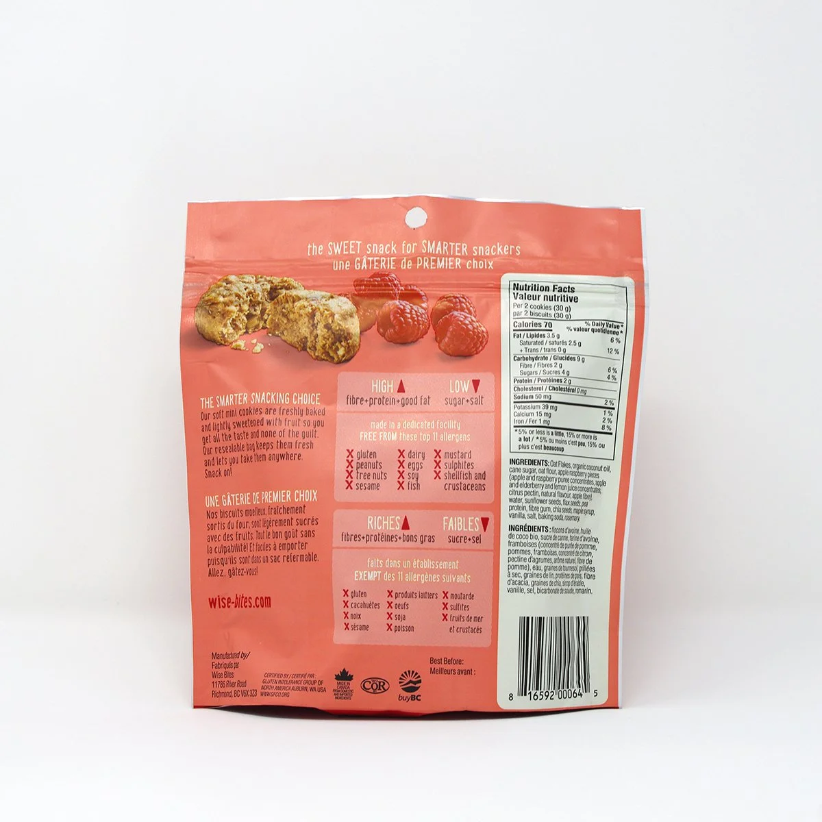
Wise Bites had an established identity, recognizable colour palette and a charming owl icon, but its existing packaging was clean to the point of feeling somewhat sterile. More importantly, too much information was competing for attention, making it difficult for consumers to quickly understand the product and its benefits at shelf.
Working independently with CREW, I was brought in to redesign the packaging around a clearer messaging hierarchy and one of the brand’s most distinctive existing assets — the owl. By taking this small icon to an unexpected, larger-than-life scale, those impossible-to-ignore eyes became the focal point of the package, giving the brand considerably more personality and shelf presence.
A lighter, more playful colour palette differentiated the flavours, while actual-size product photography and simple ingredient imagery helped consumers quickly understand what they were buying. The result was a friendlier, more energetic packaging system that retained Wise Bites’ existing brand equity while making the product easier to notice, understand and shop.
deliverables
packaging strategy
packaging design
messaging hierarchy
photography art direction
production direction
project partner
Crew Marketing